How to choose paint colors for apartments and condominiums
 Eivydas “David” Phillips
 Founder/President at Painters Inc.
The colors used in condos and apartments say much about the overall residential experience. Besides choosing the right colors, you also need a professional crew to tackle the project on a schedule that meets your needs and at a price that fits your budget.
Choosing colors that fit your architectural features and other elements of the property can be a complex project. But from kitchens to bathrooms, living rooms to bedrooms, we’ve got you covered in regard to the latest interior and exterior paint trends.
10 best paint colors for apartments and condos
From year to year, paint color preferences evolve. Red defined the 1940s and turquoise/mint was all the rage in the 1950s. Vibrant green became the go-to color in the 1960s, but shifted to a more mossy green in the 1970s. Mauve was big in the 1980s and the 1990s were known for purple. In the last few decades, we’ve seen preferences go from light blue to gray, but most recently we’re seeing a shift back to blues.
Ask anyone what the 10 hottest paint colors are right now and you are likely to get some variance in answers, but these are probably on the top 10 list for many in charge of apartment/condo painting:
Dark blue
It fits today’s trend of blues becoming a top choice for areas where architectural elements can be emphasized.
Sage
Subdued and relaxing, Sage is a color that calms the nerves of residents who desperately need it.
Earthy ochre
Paired with other warm tones, Earthy Ochre fits perfectly in living rooms and other areas where warmth is important.
Oyster white
Sometimes called “greige” due to its position between beige and gray, Oyster White is a superior choice to a sterile white paint.
Divine white
Some rooms call for a more sterile colors, but to avoid going to harshly into sterile territory is possible with Divine White.
Silver
Silver is a great color for smaller spaces, but it also embodies a more modern feel with a touch of sophistication.
Green
Another trend is toward green hues, which work nicely in rooms that need the extra warmth this color offers.
Sky blue
Open up a closed space or a room with little to no natural light with Sky Blue.
Beige
Neutral tones are always popular in apartments and condos, but pairing beige with other neutrals can add a dramatic effect.
Light grey with white trim
It’s a classic combination that has never really gone out of vogue in apartments and condos.
The pandemic has helped shape today’s color trends, according to some designers, because “cleanliness” is everyone’s concern. White is seen as a purity color (even though it technically isn’t a color). Dusty blue, dark blue and sky blue have also piqued the interests of apartment and condo owners who like the way light plays off these colors, giving rooms character and a comforting vibe, which is something most people are looking for today.
Condo and apartment color schemes
As with any home improvement project, there are going to be a list of things you should do and a list of things you don’t want to do as you consider painting your condo or apartment. The color scheme is extremely important for a number of reasons, but to help you decide, consider the following information.
There are some rules that should be followed in regard to color schemes. Only the most trusted design experts can get away with breaking these rules, so unless you’re a seasoned pro, stick with the following: 60:30:10.
This is the ratio you need to memorize in order to avoid choosing color combinations that clash. You’re basically choosing one color as the dominant shade that will be used in at least two-thirds of a space within the apartment or condo.
Color scheme example #1
Color scheme example #2
For the second color in your scheme/combination, choose something similar to the dominant color; a tone that compliments the main color without overpowering it. With this paint you’ll use roughly half of what you used with the dominant color. For the third color, you’re choosing an accent tone that will be used sparingly. The accent color will just add a little “pop” to the room, but not be distracting.
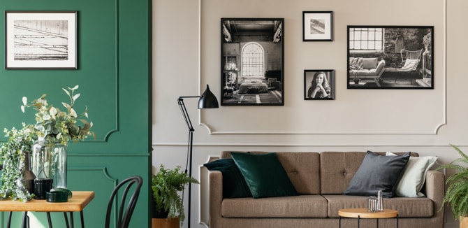
Interior paint colors
Choosing interior paint colors can be a complex issue for apartment and condo owners/managers in charge of choosing the right tones. There are so many options and so many individual aspects of each property that need to be taken into account when choosing the color(s). However, generally speaking, there are a few colors that seem like a go-to because they’re safely within the tastes of most individuals.
Neutral colors, especially in common areas, are recommended. Popular neutral colors today include gray, white, beige and earth tones.
Benjamin Moore paints that are popular in neutral tones include White Dove, White Heron, Swiss Coffee and Calm. Within the individual units, you can base color choices on the surrounding amenities. For example, if you have natural wood stained cupboards in the kitchen, you would choose a color that compliments natural wood.
Once you have nailed down the right interior colors, make sure you bring in a quality painting contractor to do the work. The investment is well worth it, because professional painters get the job done fast, efficiently and with results that no DIYer could come close to replicating.
Exterior paint colors
For those in charge of the exterior paint color of apartments and condos, the goal is often to avoid being either too garish or too boring. Much of the color palette will hinge on the architecture of the property, but there are also neighborhood elements to take into account, as well as the tastes/preferences of the residents and potential residents.
If the building is small, you might choose lighter colors to make it look larger. If white is too stark, consider line or ivory.
You can also add a little drama to the exterior by adding dark colors sparingly, such as on shutters, doors and trim. Also, if the building has aesthetic flaws here and there, darker colors can be used to hide them somewhat.
Regardless of what colors you choose, make sure you have a quality painting contractor putting them on the walls. You can choose the perfect combination of colors, but if they aren’t applied correctly, you’re not going to get any benefits out of it.
Color combinations you should try in your condominiums
Color combinations are chosen based on the mood you’re trying to set for a particular room. If you want to stay neutral, you might opt for colors that fall into the beige category and use any combination of beige tones while following the 60:30:10 rule. There are varying shades of gray and brown that also fit neatly into the neutral category.
Are you looking to warm up your spaces? Light reds and light yellows do the trick, because they are more vibrant, make a space stand out a little more and stimulate the brain. A bolder approach would be to go with a sapphire and mustard combination, but this would be used sparingly as it might not suit everyone’s tastes as much as more neutral colors. And staying on the blue theme, a popular combination today is royal blue and orchid, which works well in some kitchens.
To lighten up a space, consider mint and pale gray. This combination would also look great in a kitchen or a room that receives little natural light.
Top paint color trends for condo interior for 2024
Look no further than the top paint producers to see where the trends for 2023 are heading. Sherwin-Williams has its finger on the pulse of interior decorators and their preferences, as well as the preferences of the general public, so when the company says its ColorMix Forecast 2023 calls for bold gray, muddy greens, muted reds, homestead browns and kestrel or pure whites, you can count on them pleasing the vast majority of people.
Sherwin-Williams emphasizes the significance of color in the design of multipurpose spaces. Incorporating grounded hues contributes to the creation of a neutral environment that is suitable for various purposes. By utilizing warm and inviting colors, residents can feel comfortable and relaxed while maintaining their focus. Furthermore, introducing vibrant pops of color adds energy and personalization to individual living suites. As the ways of living in multi-family buildings continue to evolve, it is essential to select colors that complement these changes and facilitate a seamless transition.
Moreover, in response to hybrid work trends and the increasing popularity of multipurpose spaces, the multi-family industry is adapting and keeping up with current interior and exterior trends. Properties are now being designed with unique amenities that serve a dual function, catering to residents who seek a balanced combination of leisure and work areas.
Evergreen Fog
Silvermist
Mineral Gray
Toile Red
Urbane Bronze
Homestead Brown
Chatura Gray
Kestrel White
Pure White
Sherwin Williams paint colors for different interior rooms
Sherwin Williams is one of the top companies to go to for quality paints. They continuously update options and offer many recommendations that can assist you in choosing the right colors for each of the rooms in your apartment/condo. The following are some of the most recent recommendations:
-
Whole interiors
Rather than choosing a flat white color for the entirety of an apartment or condo, you can maintain a neutral theme throughout a unit without compromising on aesthetics. If the goal is to make the place look inviting, but you know the new residents will at some point choose colors that reflect their own tastes, consider rooms with various tones of gray, white, beige and earth tones.
Work with Painters Inc. to learn more about the top choices for whole interiors.
-
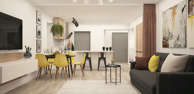
Living rooms
If your living room has no significantly interesting architectural features, you can use paint to bring some interest to it. But paint can also highlight existing architectural features that you want to stand out a little more.
A color combination of Pure White, Charcoal Blue and Austere Gray can be used in the 60:30:10 ratio for a stunning look in your living room. For a more earthy aesthetic, consider using a combination of Moderate White, Dover White, Macadamia and Wool Skein.
Need more recommendations on the right color for your living rooms? Let Painters Inc. give you a hand.
-
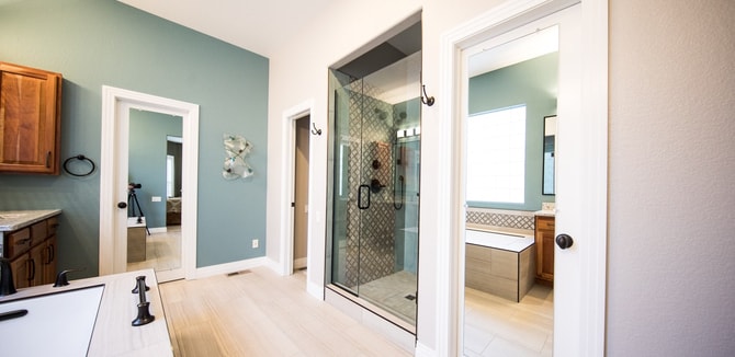
Bathrooms
In some situations, you can be a little more bold in your choices for bathrooms, which are small spaces that can use a little help from a combination of colors. One example from Sherwin Williams is a dark Black Magic accent that pairs well with a mid-green Garden Spot and a tan Double Latte color. For a lighter approach, you can use different shades of gray, including Rhinestone and Gray Clouds, but then you add a vibrant accent, such as Cajun Red, to make the room pop.
If you’re stuck on what color or scheme to use in your bathrooms, Painters Inc. has plenty of experience in this area and can assist.
-
Kitchens
Kitchens can take on many different personalities depending on the existing hardware, flooring, countertops and cupboards. You can go contemporary, country, rustic or traditional in your approach. If your kitchen receives little natural light, consider one of Sherwin Williams’ top choices for kitchens – Blue Sky, which will bring an airiness to the room.
For kitchens that get plenty of natural light, you could go with Cayenne, which is a rust-colored paint, and a lighter grayish-tan Wool Skein to balance it out. Kitchens can differ from unit to unit, so let Painters Inc. give you an expert opinion on which color schemes are going to fit each unit.
-
Bedrooms
An ongoing trend with bedrooms is to choose a calming combination of colors. Neutral Ground, an off-white tone, is one popular paint currently being used in bedrooms. Sticking with the blue theme that is popular this year, try Celestial for your bedroom, which will brighten the room but maintain the calming effect. If you’re looking to combine colors, check out Drizzle, which is a teal-like tone, and an off-white option, Downy.
At Painters Inc., we make sure every bedroom gets the attention it deserves, including determining which colors are going to look best.
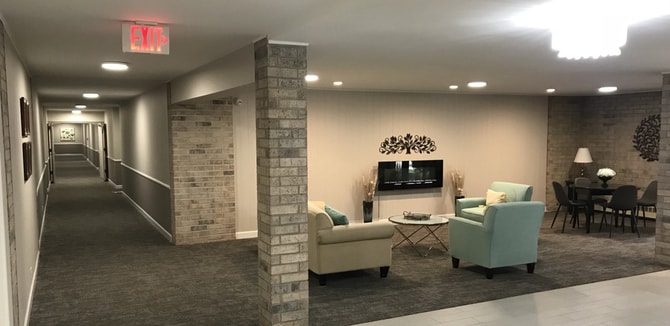
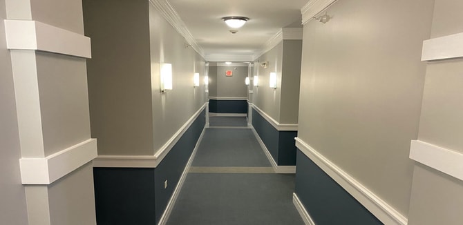
Paint colors for hallways of condo or apartment building
The most used common areas in an apartment or condo are the hallways. For this reason, it’s preferable to use neutral tones unless. An exception would be if there are existing features, such as marble or natural wood trim that is prominent throughout the hallways, in which case you can play with colors that accentuate the architecture.
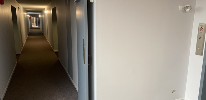
For hallways within the units, you can expand upon the neutral palette if so desired, such as a blue/tan/white approach with Sherwin Williams’ Georgian Bay, Fleur de Sel and Woven Wicker paints. If you’re looking for something with muted blues and grays, try the Morning Fog, Requisite Gray, Sleepy Hollow and Niebla Azul combination.
The best paint colors for a small condo & how to make it look bigger
The tried and true method of making a small space seem larger is to use lighter colors. In fact, a lighter color used above the eyeline makes a wall look taller. The bathroom is almost always the smallest room in an apartment or condo, but that doesn’t mean it always has to be painted white. You can actually use a strong color to make this room more transformative.
Small apartments and condos can be made “warmer” by choosing a soft blonde color with white trim. Beige is a neutral color that has rarely gone out of style, particularly in small spaces, and you might even find a throwback to the 1950s with a mint green option in various other small rooms, which can make the small space feel more dynamic.
Pearl gray has been a go-to choice for small spaces where white is considered too sterile, but for a more cheery effect, choosing a soft yellow is also an option. Sage, which is on the light side of mossy green, works well in small rooms where there is plenty of natural light. Sky Blue also really helps to make a room feel like it is more expansive.
Paint colors to avoid for rental properties
Rental properties tend to see changeover, which means prospective tenants are almost always looking at units to see if it fits their requirements. For this reason, you want to avoid bold and daring colors. While some people absolutely love paint like this, the majority are not going to be attracted to these hues.
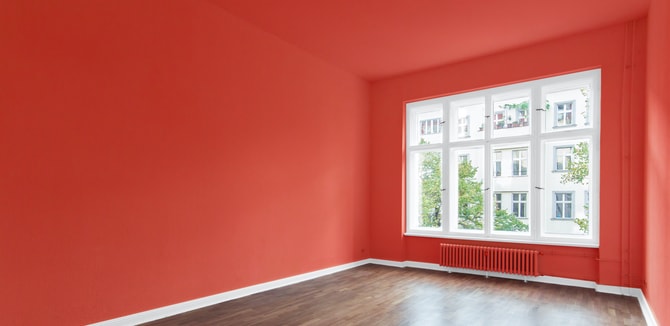
For example, people seem to love or hate bright yellow walls. There’s hardly any middle ground here, so you want to avoid that color. Bright reds and orange hues can also stir some uncomfortable emotions in prospective renters, so it’s best to avoid those.
While different types of blues are in vogue today, stay away from vibrant blue, as most people put this on the “hate it” side of their preferences. Another polarizing color that we recommend avoiding in apartments is rich brown, which seems to turn off a majority of prospective residents.
Get a professional condo painter for your next painting project in the Chicago area
Don’t trust just any paint contractor when your apartment or condominium requires interior or exterior painting. At Painters Inc., you get a trusted team of professionals that are committed to doing a quality job, keep a clean workspace and finish the project on time and on budget.
We have years of experience working with condo and apartment management on interior and exterior painting projects. We know what your specific wants and needs are and that there are tight timelines and expectations in regard to how we do our work while on your property with residents coming and going. Our crew has total respect for every property we visit and we always turn out stunning results.
Contact us and let’s talk about the details in your project.