Restaurant painting: How to choose the best color for your restaurant interior
 Eivydas “David” Phillips
 Founder/President at Painters Inc.
Choosing the right color for your restaurant painting project is vital to a successful outcome. Colors influence your customers’ opinions and moods, and colors can help you achieve the ambiance you’re looking for in your restaurant’s interior. But you also have to ensure that the colors you choose actually sync, as it can be easy to get the combinations wrong.
Did you know colors can evoke specific emotions and elicit specific behaviors in your clientele? For example, did you know colors are responsible for impacting such vital things as hunger and thirst? A professional painting contractor can assist you in choosing the colors that fit the emotions and behaviors that will benefit your business.
While you work toward building up the theme of your interiors, you’ll also need consistency, which is something choosing the right colors can achieve. Work with a painting contractor to help you choose the best color for your restaurant.
Check out the following to figure out which is best for you:
- The significance of color selection in restaurant interior design
- Factors to consider when choosing restaurant paint colors
- How does restaurant interior color affect your customers
- Color psychology for restaurant wall painting design
- Restaurant interior design color combinations
- Light colors for restaurant interior painting
- Dark colors for restaurant interior painting
- Bright colors for restaurant interior painting
- 10 restaurant interior color scheme ideas
- Tips for choosing the right paint color based on restaurant type
- Which colors should you stay away from in restaurant interiors?
- The best paint color for restaurant ceiling
- The best paints for restaurant walls
- Hire a professional restaurant painting contractor in the Chicago area
- Top 10 frequently asked questions about restaurant painting
The significance of color selection in restaurant interior design
Among the most crucial aspects of restaurant interior design is color. From seat cushions to plates, glasses to napkins, and especially the color of the walls, ceiling, baseboards and other painted surfaces, color will be among the most vital design priorities.
It’s all about the atmosphere. Are you looking for a cozy vibe or one that is more vibrant and electric? Your restaurant will have a theme, whether it’s a blatantly obvious one or one that is more subtle, and the colors you choose can make that theme resonate with your clientele.
When you nail the restaurant color scheme, you’ll hit other goals that are impactful to the bottom line, including bringing in more clientele, stimulating their desire to eat and drink and keeping them in your establishment for as long or short as you want.
Factors to consider when choosing restaurant paint colors
Painting is a trade that takes years to achieve a high level of skill, but it’s about much more than skills related to deftly applying layer after layer of paint on surfaces with exacting precision. While that is important and something that DIYers regularly fail at achieving, professional painters know what colors work in specific spaces. The right contractor will listen to your thoughts about your restaurant’s theme, the type of place you envision it will be and then the contractor will help choose colors that fit.
The best paint color for restaurants will differ depending on a variety of factors, but when you communicate your needs to a trusted professional, you’ll get valuable results.
Branding and theme
Your brand must shine in all your restaurant’s interiors, particularly the painted surfaces. In order for your customers to have an experience they won’t forget, you need to have consistency in your color scheme.
Ambiance and atmosphere
From deep, dark and moody to bright and lively, paint colors will create an ambiance that speaks to the theme you’re working to achieve.
Customers
Do you want to attract kids or is your restaurant geared toward adults? Is it a family atmosphere you’re looking to achieve or do you want to appeal to couples out on date night? There are colors that appeal to different types of customers.
Restaurant type
A diner is going to have a completely different paint scheme than an upscale steakhouse. A fast food joint is not going to share many similarities in its color palette with a cocktail lounge. The restaurant type will help dictate what choices are made in regard to the color of the paint. For example, a restaurant that serves vegan food for health and fitness enthusiasts is well served with vibrant green paints and associated earth-tone colors. Fine dining establishments can achieve a more sophisticated ambiance with subtle gray hues.
Space and layout
If the space is small and needs to appear larger, lighter colors work best. And while darker colors can make a space feel smaller, dark also enhances the cozy feelings that some restaurants are going for.
Lighting
An establishment with abundant windows will need to factor that into the paint color, as abundant natural light can have an impact on the way a color looks. Introducing artificial light will also impact how color works in a room. These lighting scenarios must be factored into the color choice.
Practicality and maintenance
Some colors look better with different finishes, but it’s important to choose the right finish for the right rooms. For example, high-traffic areas need frequent cleaning, which means a glossy finish will be the most practical choice, as it holds up well to scrubbing.
Mood and emotion
Bright colors, such as pastels and vibrant reds and oranges, can make people feel energetic and more social. Choosing grays and blues can make them feel calm and relaxed. Just about every color evokes an emotion, which should be considered as you dial in the theme of your restaurant.
Complementary colors
It’s rare that you’ll achieve the desired effect by going with bold colors that create visual dissonance. Harmonious color schemes follow a specific pattern and experts can help you make the right choices.
Visual flow
Separate rooms in your establishment might have different uses, which means they could have different colors, but there is a way to integrate colors that create a seamless visual flow. Whether it’s creating that flow from hallways to rooms or from the entrance to the main seating area, work with a professional to assist you in creating that natural flow.
Staff and customer comfort
Restaurant interiors need to be designed around pleasing customers, but when you get it right, your employees will also reap the benefits.
When you take careful consideration of all these factors, rest assured that whichever theme you choose, you’re going to achieve the ambiance that perfectly fits.
How does restaurant interior color affect your customers
The wall painting design for restaurants requires plenty of planning, as there are many, many aspects that need to be considered. While it is important to consider the layout of the seats and tables, one of the first things your customer is going to notice is the overall ambiance of the interiors, which are highly impacted by the colors of paint you use.
There is plenty of psychology behind colors and how they affect mood, emotion, appetite, comfort, safety and much more. On top of the emotions you’re trying to elicit, you also have to consider the theme of your restaurant and the colors that will fit it.
Let’s explore the psychology of color more deeply and develop a better sense of which emotions are triggered by specific hues.
Color psychology for restaurant wall painting design
Selecting colors for a restaurant is no small feat, as there are many combinations to choose from, and getting the right color is imperative to the success of the business. In fact, restaurant wall painting jobs should only be undertaken by professionals who know the value of the psychological impact of the colors.
The following overview underscores the impact of each popular color in restaurant interior painting.
White color in restaurant design
White interiors in a restaurant evoke a feeling of leisurely ambiance, but white is also described as tranquil. White colors in a restaurant can be excessive if used on too many surfaces and are best paired with other hues. Keep in mind that white can make a small space appear larger, but overuse can create a sterile atmosphere.
Dining establishments that incorporate white in their interiors:
- Cafes
- Fine dining restaurants
- Bistros
- Casual dining restaurants
- Patisseries
- Bakery cafes
- High-end eateries
- Boutique restaurants
- Dessert bars
- Wine bars
These establishments take advantage of the leisurely calming effect of white, while also capitalizing on the color’s ability to work well with just about any other color.
Brown color in restaurant design
The most “earthy” of earth tones, brown induces feelings of comfort and relaxation. Earth tones are known for their ability to create a supportive, stable atmosphere, which is what diners appreciate when they want to feel welcomed in an establishment. Brown colors in a restaurant work well with other earth tones, including various shades of green.
Dining sites commonly utilizing brown in their interior design:
- Cozy cafes
- Rustic-themed restaurants
- Farm-to-table eateries
- Steakhouses
- Wine bars
- Pubs and taverns
- Casual dining restaurants
- Comfort food restaurants
Brown is often balanced with cream and green hues, fostering a rustic, yet modern look. Professional painters are careful not to go overboard on brown, as too much can create a dull atmosphere. The selective use of brown can enhance interiors, promoting a natural connection and an ambiance befitting of a variety of dining/drinking sites.
Green color in restaurant design
Green is a popular earth tone that provides an ambiance of relaxation and comfort. However, you’ll often see it in establishments where the focus is on healthy foods, as green is a symbol of nature and appealing to those who seek out more “natural” foods.
Dining sites that utilize green in their interior design:
- Farm-to-table restaurants
- Organic cafes
- Juice bars
- Fresh salad eateries
- Health-conscious bistros
- Vegan and vegetarian restaurants
- Smoothie shops
- Plant-based cafes
A refreshing and health-conscious ambiance is the most sought-after theme in restaurants that use organic, natural foods in their menu items. Green is the color of freshness and vitality, but it can also inspire an appetite.
Yellow color in restaurant design
Radiating energy and warmth, yellow colors in restaurants create a vibrant and inviting atmosphere. It’s a real mood lift that is often used in establishments where fun is the objective, but it’s also found in breakfast joints where early rousers get a kick start on the day.
Dining sites that can consider incorporating yellow in their interior design:
- Breakfast cafes
- Brunch spots
- Casual dining restaurants with a vibrant atmosphere
- Family-friendly eateries
- Ice cream parlors
- Food trucks with a cheerful theme
- Juice bars
- Tropical-themed restaurants
Establishments using yellow can range from kid-friendly spots to ice cream parlors to cafes. The overall theme with yellow is not of relaxation, but rather of lively and cheerful experiences. Yellow can also function as a secondary/accent color to other vibrant colors and achieve similar results.
Orange color in restaurant design
Orange is used in spaces where a dynamic and stimulating aura is the goal. It’s a warm color known for its inviting vibe, yet also imparts feelings of creativity. Orange color in a restaurant also plays well in spaces where socializing is the norm. Not a color for intimate, quaint dinners, orange is the hue for lively conversation and engagement with others.
Dining sites that can consider incorporating orange in their interior design:
- Dessert cafes
- Bakery shops
- Donut stores
- Juice bars with a focus on sweet treats
- Candy shops
- Smoothie and milkshake joints
- Pastry shops
- Confectionery outlets
When balanced with other tones, orange creates warmth and intimacy, especially with the right lighting. If you’re looking to impart a convivial, engaging ambiance for casual gatherings and celebratory occasions, orange will do the job.
Red color in restaurant design
Appetite stimulation is often most associated with the color red, but it’s also a color that inspires passion. The red color in a restaurant evokes a sense of energy and urgency. You’ll find that red interiors in a restaurant provide dynamic and attention-grabbing responses. It’s no surprise that red has also been associated with influencing quick eating for a faster turnover rate.
Dining sites that can consider incorporating red in their interior design:
- Steak houses
- Italian restaurants
- Pizza parlors
- Mexican eateries
- Asian fusion restaurants
- BBQ joints
- Sports bars
- Diners and burger spots
Moderation is the key with red, as it is an overwhelming color, especially in the more vibrant hues (like candy apple red). It is best used to add a touch of drama and vibrancy where it can arouse emotions, but not take them too far. There is no doubt that red leaves a lasting impression.
Blue color in restaurant design
Known for its calming and soothing effect, blue is more associated with places where tranquility is the theme, which doesn’t always suit the restaurant industry, as blue doesn’t stimulate appetite. However, it is found in niche markets, such as restaurants serving seafood, lakefront establishments and any bar that is going for an ocean/beach theme.
Ideal for incorporating blue in the interior design of:
- Coastal-themed restaurants
- Seafood restaurants
- Beachfront cafes
- Ocean-view dining establishments
- Tropical-themed bars
The best use of blue colors in restaurants is with soft lighting and natural textures, allowing the color to exude its elegance and sophistication. Blue can contribute to patrons unwinding and enjoying their company and the overall dining experience.
Purple color in restaurant design
Purple colors in a restaurant are associated with regality, yet purple also cultivates an atmosphere of creativity and luxury. Purple can symbolize opulence, but also individuality, which can really make it stand out. Its use in restaurants is fairly rare, possibly because of its association with polarizing foods (red onion, eggplant, red cabbage).
Ideal for incorporating purple in the interior design of:
- Upscale restaurants
- Innovative eateries
- Gourmet cafes
- Specialty dessert shops
- Trendy fusion restaurants
- Culinary experience venues
- Creative cocktail bars
- Artistic dining concepts
- Luxury lounges and bistros
If you’ve got a VIP section in your establishment, purple could be the go-to color, as it also enhances a sense of exclusivity. Sophistication and uniqueness are also common descriptors of purple, which is why it is used in upscale restaurants. Purple must be used thoughtfully, as it can be overwhelming, but one done right, it can help create an extraordinary dining experience.
Black color in restaurant design
Modernity and elegance are perhaps two of the best words describing black paint colors in a restaurant, whether it’s a matte or glossy paint. When bold sophistication is the objective, black is employed to create just that, but it can also be used to create contrast, allowing various architectural elements to shine.
Ideal for incorporating black accents in the interior of:
- Upscale fine dining restaurants
- Trendy urban eateries
- Modern fusion restaurants
- High-end steak houses
- Stylish cocktail lounges
- Nightclubs
Culinary allure and urban refinement can also be achieved by using black, which is why it’s a popular color in fusion restaurants. Keep in mind that black is dominating, which means it needs to be used strategically and integrated with various other elements of design, from fixtures to wall accents and carpet to drapes.
There is power in color, as each shade, tone and hue has an effect on the psyche. By carefully planning your decor, testing various colors and getting input from professionals, you can make the right decision and provide your guests with the ambiance you are shooting for.
Restaurant interior design color combinations
Rarely is the interior of a restaurant one color and there is good reason for that, as color combinations do a far better job of creating a mood than a single color alone. Interior design color combinations might follow trends, but those trends are generally tied to what consumers demand, so it pays to keep tabs on what consumers want.
The best color combination for restaurants will differ depending on a variety of factors, but the following are examples of how various colors impact design schemes.
Light colors for restaurant interior painting
Smaller spaces in restaurants that need to appear larger will achieve that effect with light colors. However, the space doesn’t have to be small to achieve a specific ambiance with a lighter color. For example, you can evoke a relaxing, leisurely feel with light colors. Also, you’ll see a blend of light colors at play in upscale eateries.
If your goal is to get customers in and out in a hurry, light colors might not be for you, as the calming effect can create an environment where people are happy to chill out and stay for longer periods of time.
Light color scheme: classic white, soft beige, pale gray, light blue, creamy yellow
Classic white
Versatile and timeless, white complements any restaurant theme and creates a clean and fresh look.
Soft beige
Elicits a warm and inviting atmosphere, making it an excellent choice for creating a cozy dining space.
Pale gray
Adds a touch of sophistication and elegance, perfect for contemporary and upscale restaurant settings.
Light blue
Infuses a calming and tranquil vibe, ideal for beach-themed or coastal restaurants.
Creamy yellow
Evokes a cheerful and sunny ambiance, making it an excellent option for cafes and family-friendly eateries.
The impact of light wall color on restaurant customers
Soft, light hues, including neutrals and pastels, create an airy and open ambiance. This is important for smaller spaces, but light wall color schemes are not exclusively for quaint areas. Rather, restaurant wall painting plans that include soothing hues of lighter paint bring a relaxing feel to dining establishments of all sizes and are particularly suited for spaces where customers want to spend a lot of time savoring their dishes.
Pales yellow and cream colors are a great example of light colors that convey a sense of warmth and nostalgia, which is a great fit for family-friendly establishments. If your business focuses on healthy foods, choose a light green to achieve that health-conscious feel while maintaining the airiness that light colors bring.
Light colors can also help you achieve a well-lit environment, which can enhance a space with plenty of natural light, but also perk up a space with a lack of natural light. Keep in mind that light colors also encourage social interactions, which means spaces where you want to maintain an elegant and exclusive feel will have to resort to other design elements and seating arrangements to maintain that level of intimacy.
Advantages of using light colors in restaurant interior
The following are some of the biggest advantages you’ll experience by utilizing lighter colors:
- Illusion of space. Light colors create the perception that a small space is larger than it actually is, which is of particular interest to restaurant owners lacking the space they desire.
- Relaxing atmosphere. When you want your customers to sit back and relax, the soothing hues of light colors bring a great level of calm and comfort. But beware: this will also encourage them to stay longer.
- Upscale ambiance: Get that upscale and refined vibe you’re going for with light colors, which can be balanced with other upscale design elements to get just the right level of class.
Disadvantages of using light colors in restaurant interior
Light colors won’t work for every environment. The following are some of the situations where they aren’t a great fit:
- Lack of vibrancy. While light colors are airy, they can come off as too sterile for some environments. Light colors simply aren’t bold, which do not work in a space that is meant to be energetic.
- Stain visibility. High-traffic areas are prone to dirt and grime, which means light colors will show every mark, scuff and smudge. If you aren’t keen on frequent cleaning, stay clear of light colors.
- Limited versatility. Interior design possibilities are not as abundant with light colors as they are with darker hues, which can limit your options for themes.
There are obvious advantages to painting a restaurant with light colors, as they evoke a feeling of warmth and comfort, relaxation and harmony. Spacious and airy, light colors can truly transform a room. Also, there are so many varieties of hues from which to choose, from pastels to toned-down greens and blues. If you want to make a lasting impression on your patrons, light colors fit the bill.
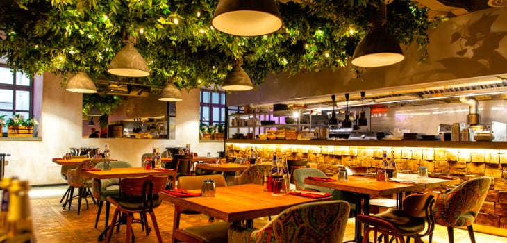
Dark colors for restaurant interior painting
Cozy, intimate and romantic, dark colors can inspire a dramatic atmosphere. From bars to trendy restaurants to bistros that cater to couples nights, dark color painting schemes bring a wealth of opportunities to these establishments.
Balance dark tones with reflective surfaces and bring in lighter accents to create a contrast that maintains an inviting atmosphere, but adds a little extra touch of elegance. From deep blues to charcoal grays, sophistication and warmth are possible with these and similar dark color painting combinations.
Dark color scheme: deep charcoal, espresso brown, midnight blue, burgundy, hunter green
Deep charcoal
Sophisticated and rich, deep charcoal is perfect for creating an elegant and contemporary ambiance.
Espresso brown
Exudes warmth and comfort, adding a cozy and inviting feel to the dining space.
Midnight blue
Evokes a sense of mystery and tranquility, ideal for upscale and intimate dining settings.
Burgundy
Intense and deep hues of burgundy bring opulence and luxury to the forefront.
Hunter green
Natural and earthy, deep colors like hunter green are suitable for rustic and nature-inspired restaurant themes.
The impact of dark wall color on restaurant customers
Dark wall colors in a restaurant are the go-to paint choice for restaurateurs who want to evoke a sense of intimacy and luxury, setting the mood for a cozy evening of dining. You can actually create a variety of atmospheres and emotions with dark colors, but when used thoughtfully, dark hues will establish an intimate and romantic setting, which is what many trendy restaurant owners/managers are striving for.
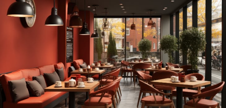
Dark colors are also chosen for bars and romantic bistros where the vibe is one of luxury, and just the slightest hint of snug elegance. Discerning diners who want an evening of sophistication seek out spots like this.
To avoid drifting into a gloomy area with dark colors, choose accent colors that balance the mood. Also, be mindful that dark can have an impact on customers who do not like feeling like they’re in an enclosed space.
Advantages of using dark colors in restaurant interior
The ambience possibilities are numerous with dark wall colors in a restaurant. The following are some of the advantages you gain by going dark:
- Intimate and romantic ambiance. For an intimate atmosphere that borders on cozy, choose dark colors, which are also befitting of restaurants where romantic dates are the norm.
- Sophisticated and upscale image. With the right mix of dark colors, sophistication and elegance can be achieved. A restaurant that needs its image elevated for discerning clientele should update with dark hues.
- Enhanced focus on decor. When the decor needs to take the spotlight, don’t outshine it with bright colors – choose moodier hues and let your furnishings and fixtures take center stage.
- Cozy and inviting feel. A cozy ambiance is inviting. Customers feel warm and comfortable in rooms with dark colors, but they are also compelled to stay longer.
- Reduced visibility of stains and wear. High traffic can lead to high levels of grime, scuffs and areas that need to be cleaned and repaired. Dark colors do a great job of hiding areas that would otherwise appear stained.
- Unique and memorable atmosphere. Leaving a lasting impression on a customer increases the likelihood that they will return. Dark colors help to create unique experiences that will help set your business apart from others.
- Complements specific themes. Nothing beats dark colors for helping to capitalize on themes that are unique to speakeasies, whisky libraries, high-class lounges and upscale steakhouses.
Disadvantages of using dark colors in restaurant interior
Are dark colors going to be a go-to hue for every restaurant or bar? Not likely. The following are some of the most common reasons why choosing a lighter shade is a better move for some establishments.
- Perceived reduced space. If your space already feels confined, dark hues will make it more so. Overuse of deeper tones can also create a vibe that doesn’t feel inviting.
- Dim lighting concerns. Without the right amount of natural or artificial lighting, dark colors will create a dim, dark atmosphere. Efforts to light up dark spaces can also create a larger utility bill.
- Limited versatility. While dark fits some concepts quite well, it’s limited to those concepts and can stifle interior design ideas.
- Lack of vibrancy. Some eating establishments benefit by having a dynamic and lively atmosphere, which can’t be achieved with dark hues.
- Potential mood impact. Some customers have a negative experience in dark spaces. Rather than feeling cozy and warm, they feel melancholic. This can lead to a negative perception of your establishment.
While it’s not likely that a restaurant or bar owner will choose dark colors for a room that requires vibrance and energy, be wary of how dark hues can impact the mood of a space. Misuse of the color can take a room over the edge from cozy and warm, and straight to dark and gloomy.
With the right balance and in the right situations, darker tones can be the perfect match for an establishment that has carefully planned decor elements, from natural and artificial lighting to drapes and wall art. Working with a professional painting contractor will ensure you’re on the right track.
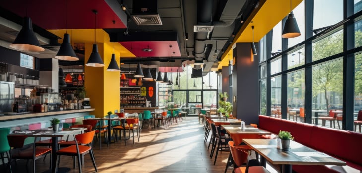
Bright colors for restaurant interior painting
Vivid hues, such as reds and various splashes of yellow and orange, can stimulate an appetite and induce guests into a more excited and energetic mood. Positive and warm, bright colors convey enthusiasm and foster inviting vibes that can create a memorable experience for customers.
Can bright colors be overwhelming? Yes. When a space needs to induce a more relaxed, calm energy, bright colors will be the wrong direction to go. However, in a place where the dining is casual and you want people in and out in a jiffy, bright color painting is the way to go. For more restaurant wall color ideas that touch on the more vibrant hues, read on.
Bright color scheme: vibrant red, cheerful yellow, energetic orange, lively green, bold blue
Vibrant red
Exudes energy and excitement and is often used in fast-food restaurants and establishments seeking a lively ambiance.
Cheerful yellow
Evokes happiness and warmth, ideal for cafes, brunch spots and family-friendly eateries.
Energetic orange
Adds a burst of enthusiasm, commonly found in dessert cafes, ice cream parlors and juice bars.
Lively green
Creates a fresh and inviting atmosphere, popular in health food stores, salad bars, and vegetarian restaurants.
Bold blue
Conveys a sense of tranquility. Perfect for ocean-inspired themes and is found in seafood restaurants and coastal eateries.
The impact of bright wall color for restaurant customers
Bright wall painting in a restaurant, particularly red and yellow, evoke urgency and hunger, but also influence a fast turnover of customers. But be careful – going too intense can create a sensory overload situation, which means the guest might begin to feel uncomfortable.
Fast-paced establishments rely on their bright wall colors to keep the ambiance exciting, but there is also an effect on the appetite of customers. For example, did you know red makes portion sizes seem smaller? But colors also impact the way guests react to each other, so when you use bright tones, expect more social interaction and liveliness among them.
Advantages of using bright colors in restaurant interior
Here are a few of the major benefits you'll enjoy when incorporating vibrant colors:
- Vibrant and energetic atmosphere. Get an infusion of energy and excitement by painting your walls a bright color. Guests will feel captivated by the lively and dynamic space.
- Increased appetite. Red and orange are most associated with increasing appetite. When you want guests to really look at the menu and get what best suits their cravings, bright colors aid in that endeavor.
- Positive mood and emotions. To ensure the guest has a good time and creates a positive memory of your establishment, use bright colors, as they can boost the mood of customers and evoke positive emotions.
- Eye-catching and memorable. Rather than creating a “meh” interior, infuse it with bright colors and exciting combinations of robust and lively tones. The more eye-catching your interiors, the more memorable your business will be.
- Ideal for high-volume establishments. Have you noticed how busy restaurants are almost always brightly colored? When you want your customers to have a blast, but get in and out as fast as possible, bright tones will help you achieve this goal.
Disadvantages of using bright colors in restaurant interior
While vibrant tones can be a perfect match for some businesses, there are some drawbacks that need to be considered.
- Overwhelming ambiance. Misuse of bright colors can be too taxing on the senses. It’s simply too busy and nerve-racking to be enjoyable for some people.
- Reduced relaxation. If your restaurant needs to be cozy, intimate and relaxed, bright colors will do exactly the opposite, because they’re too stimulating for a space that requires tranquility.
- Distracting from food presentation. If you want your food to be the star of the show, don’t let your interiors upstage the meals. Bright environments will take away from your food presentation.
- Impact on mood. Bright colors can be jarring for some diners who come away from bright spaces feeling over-stimulated and in need of an antidote to the intensity.
- Seasonal trends. Choosing a bright color because of seasonal trends will require extra work later when the trend sways back to darker tones. The process can be time consuming and costly.
There is a time and place for bright colors and when done right, the customer will come away feeling positive about their experience. However, care needs to be taken in color selection, as going too far can have a negative impact on the overall customer experience.
Work with a painting professional to find the right balance and you can achieve the desired effect, because an environment can be stimulating, exciting and inviting at the same time. If you want your customers to interact with each other, get in and out quickly yet come away with a desire to return, bright colors can help you achieve these goals.
10 restaurant interior color scheme ideas
Looking for restaurant interior color schemes that might fit with your ideas about the mood of your establishment? The following are some of the more popular themes and corresponding colors related to restaurant interior painting projects.
1. Coastal color scheme
Nothing says “coastal” like blue, especially soft blues that bring water and sky to mind. Sandy neutrals harken to beaches while crisp whites bring the wispy cloud and white-capped sea elements into the mix.
2. Rustic farmhouse color scheme
“Barn red” is the most popular color of barns throughout America’s farmland and plays perfectly in restaurants where the rustic farmhouse look is the goal. Also, think about incorporating earth tones, such as olive green and terracotta, to provide a warm ambiance.
3. Industrial chic color scheme
Exposed brick and cool grays bring a modern appearance that fits the industrial chic theme. When urban and hip is the goal, keep it trendy with metallic accents, which can liven up the grays.
4. Vibrant tropical color scheme
Keep the mood lively with colors that really splash, like coral and turquoise, or bring in a bright yellow to introduce an even more tropical and festive atmosphere. From a fun cocktail bar to a beach/tiki-themed joint, these vibrant colors really work.
5. Urban oasis color scheme
Whether it’s a health food establishment or a juice bar, create a green space with calming green tones on your interiors. Great accents for an urban oasis include various neutrals from gray to black.
6. Vintage diner color scheme
Pale pink, peach and mint green meshed together create a classic combo reminiscent of diners of yesteryear. Looking for a soda fountain vibe? Bring pastel into the mix and you’ll be on the right track.
7. Elegant monochrome color scheme
Sophistication and elegance are attainable with the regal color – purple. Putting the focus on a single color is common in high-end establishments, so go with various shades of purple or shades of a deeper blue hue.
8. Mediterranean color scheme
When Mediterranean cuisine is on the menu, appropriate choices for paint color include olive green, golden yellows and warm terracotta hues. These are popular choices in Mediterranean bistros and Italian-style eateries.
9. Modern Art Deco color scheme
Chic restaurants and upscale lounges where fancy cocktails are in vogue lean toward modern decor, which is why choosing metallic paint finishes in gold and silver are so popular. Art Deco design enthusiasts refer to these as their “go-to” colors.
10. Minimalist Scandinavian color scheme
A color trend that seems to be here to stay is the minimalist Scandinavian scheme, which embraces a muted feel with various toned-down hues of gray, soft pastels and blondes. Modern and contemporary eateries embrace these colors.
We pride ourselves at Painters Inc. on our ability to stay on top of all the trends and know which ones have staying power. Whether it’s a casual restaurant where the food is fast and so is the service, to trendy, upscale restaurants where customers go for a fine dining experience – we’ve got you covered.
If you have a vision for your establishment and need a professional opinion on the colors, as well as an expert contractor to do the work, you can count on the guidance and skills of the team at Painters Inc.
Tips for choosing the right paint color based on restaurant type
The best color for a restaurant depends on a variety of factors, but the most important thing is that your colors match your theme. To ensure the ambiance is befitting of your menu and your customers’ expectations, consider the following information.
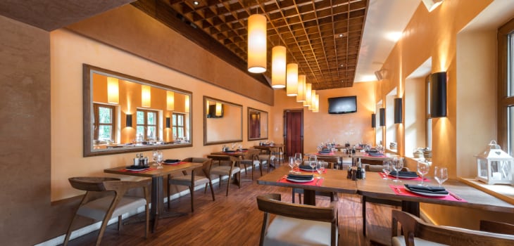
Upscale restaurant paint colors
Upscale restaurant owners want their patrons to feel like they’ve entered a luxurious setting, which is why they choose warm neutrals, rich purples and deep blues – all of which provide that upscale feel. Fine dining establishments also lean on ivory, white and beige for a relaxed atmosphere that allows customers to sit back and savor their menu selections.
Casual eatery and cafe paint colors
Patrons at casual restaurants want comfort and ambiance, which they get with warm oranges, soft yellows and subtle green hues. These colors provide that laid-back experience, but they’re still lively enough to fit a casual dining experience.
Small restaurant and bistro paint colors
Small spaces require a bit of brightness to make them appear more open, larger and less closed in. Choose warm pastels and soft neutrals. Also, earthy colors can match the theme most bistro owners try to convey.
Trendy fusion restaurant paint colors
Be bold and adventurous with your trendy fusion restaurant and choose energetic colors, like orange and red. These boisterous colors match the innovative cuisine and lively dining experience.
Fast food restaurant paint colors
Almost everything about the fast food experience is fast. Owners count on volume, so they choose bold colors, like red, yellow and orange, to pep up the atmosphere and keep customers coming and going fast.
Health food stores and vegetarian restaurant paint colors
Green is associated with health in everything from the environment to the foods we eat, which is why health food stores, vegetarian restaurants and juice bars employ green so often. Also popular are warm browns and soft yellows.
Ethnic eateries or authentic cuisine
Embracing the colors of the culture of ethnic eateries is important. For example, Mexican restaurants often choose warm terracotta, red, deep blues and earthy greens, which are reflective of Mexican culture.
Coffee shop or bakery paint colors
Earthy tones take the top paint color positions in coffee shops, which include mocha, taupe and deep brown. Soft grays and muted blues are also popular. Color combinations like these complement the coffee culture and encourage relaxation.
Bar or nightclub paint colors
Lively bars and nightclubs often lean toward bold blues, vivid purples or dark and moody shades to match the vibrant nightlife scene. Metallic accents and glossy finishes are also popular, as they enhance the lighting effect.
Paint colors are vital in setting the right tone in an establishment, but always take into consideration the natural light, as well as the artificial light, and the way it works for or against your paint colors. Testing your top choices will help you select the right one and avoid a trial-and-error period.
Which colors should you stay away from in restaurant interiors?
When a restaurant is painted the wrong color(s), patrons let them know – by not coming back. Rather than risk this happening in your establishment, see how various restaurant wall paint colors can result in negative reactions.
Bright and overstimulating colors
While vibrant colors can match the theme of some restaurants, including them in spaces where patrons want to feel relaxed and leisurely enjoy a meal is a no-no. Too much stimulation with bright/neon colors creates sensory overload.
Dull and drab colors
Monotonous colors can dampen the mood of patrons who are out to have a fun time. Lackluster, drab colors used repeatedly without lively accent colors to break them up is unappealing to customers.
Unappetizing colors
Some shades of green and brown have a psychological effect on patrons, ruining their appetites. These are colors often associated with food that is spoiled. Greenish-brown, sickly yellow and muddy tones are best avoided.
Aggressive reds
Bright red can suppress the appetite, increase the heart rate, cause difficulty relaxing, clash with food presentation and present a lack of versatility in decor options. This level of unease will have patrons running for the door.
Jarring combinations
Trying too hard to be vibrant and exciting can result in jarring outcomes. Heavy dark colors, monochromatic schemes, and high-contrast clashes are all bad choices in restaurants because they create visual dissonance.
Excessive white
Don’t risk creating a sterile environment by overuse of white paint. An abundance of white creates an impersonal and unwelcoming ambiance.
Unflattering lighting
You might have chosen the best color scheme for your establishment, but if you get the lighting wrong, it will ruin your ambiance. Check with your painting contractor about your natural and artificial light and how it will play with the colors of your interior.
If you want to distance yourself from the risk of going too bold, too drab, too dramatic or too jarringly vibrant in your establishment, partner with Painters Inc. and let us guide you in the right direction. We understand the importance of paint colors and how they impact the ambiance of restaurants, bars, cafes, diners and eateries of all types.
The best paint color for restaurant ceiling
Every restaurant follows a theme dictated by the desired ambiance of the establishment and how it will impact the patron. Therefore, the best color for a restaurant ceiling is dependent on that theme. For some, traditional white will be the choice because they want to create spaciousness and cleanliness. Others will choose neutral tones for a more warm and inviting atmosphere. Some restaurant owners choose dark colors for their ceilings for a cozy and intimate vibe.
A restaurant painting contractor is the best source for accurate information about paint colors for ceilings, as they will know how to choose the one(s) that best fits the overall theme/scheme.
The best paints for restaurant walls
The best paint for restaurant walls depends on several factors, but an important one is the amount of traffic that will travel through specific areas. A durable paint with a high gloss is usually the best option for high-traffic areas because it stands up to use, is easy to clean and maintains its look after frequent cleaning.
Restaurant wall painting needs will differ depending on the type of restaurant. For example, a fine-dining establishment looks better in an eggshell or satin finish than it does in a high-gloss finish. Even if they are in need of more frequent repainting because of high traffic, the effort is worth it.
While color choices will always be important, restaurants benefit from mildew- and moisture-resistant paints, especially in the kitchen and bathrooms. Maintaining healthy air quality is also a consideration, which is why low-VOC (volatile organic compounds) and zero-VOC paints are popular for restaurant walls.
Benjamin Moore wall paints for restaurants
Benjamin Moore paints are known for their top quality throughout the country. From their wide range of colors to the brand's reputation for delivering a durable product that spreads evenly and lasts a long time, contractors everywhere know the value of using Benjamin Moore.
From creating a warm and inviting ambiance with rich earth tones or achieving a modern and sleek look with bold hues, Benjamin Moore paints cater to diverse design preferences. Benjamin Moore also offers paint with low VOC content, which ensures a more environmentally friendly painting environment.
Painters Inc. frequently uses Benjamin Moore for its durability and aesthetic qualities.
Sherwin-Williams wall paints for restaurants
Restaurant painters are no strangers to Sherwin-Williams wall paints. When top quality, durability, looks and reliability are on the list of must-have items, professional painters know where to go. Sherwin-Williams paint provides excellent coverage, but professionals also choose this paint because it can hold up to demanding environments like restaurants.
Aside from creating quality products, including those that are low to no VOC, Sherwin-Williams also offers a variety of colors – so many that they can fit any theme in any type of restaurant. Whether it’s a small diner or an upscale restaurant, Sherwin-Williams has paint that can match the mood.
Hire a professional restaurant painting contractor in the Chicago area
When you know what type of ambiance you’re going for but need an expert’s opinion, as well as an expert to paint your restaurant, choose Painters Inc. We’re the restaurant painting contractor that has years of experience helping clients of all types get exactly what they want and need. We’re focused on offering professional services that yield high-quality results that last for a long time.
Don’t just take our word for it – ask around and see what others have said about what we offer restaurants, bars, cafes, diners, nightclubs and bistros. Our experience speaks for itself, but our clients appreciate that we’re insured, certified and that we guarantee our work – just ask them.
Contact us and let’s discuss your painting project and all the color options that will fit your theme.
Top 10 frequently asked questions about restaurant painting
Feeling overwhelmed trying to choose the best wall color for your restaurant? Many have been here before you, but fortunately, we have answers to the most frequently asked questions.
What are the best colors for creating a welcoming and comfortable ambiance?
For a calm and relaxed environment, choose neutral colors. Restaurants often utilize light greens, soft yellows and beige, while avoiding colors that are too vibrant to create a comfortable atmosphere.
Are there colors to avoid in restaurant interiors?
Suppressing the appetite or creating an atmosphere that is too intense or jarring can happen with the wrong shades of blue (often bright blue) and some shades of purple. Neons rarely work because they are simply too bold and distracting.
How do different colors affect the perception of space?
The rule of thumb is that light colors open up a space while dark colors make them appear smaller. At the same time, darker colors can create comfort while lighter colors can inject energy into spaces.
What are appetizing color choices for restaurants?
Stimulating the appetite is important in eateries, which is why rich browns and succulent purples are used so often. Fresh greens can also enhance a patron’s appetite.
What colors are recommended for fast-food restaurants?
Fast food is known for its fast turnover, which is why bright and vibrant colors are the go-to paints. For appetite stimulation and quick turnover, choose red and yellow.
Which colors are suitable for upscale restaurants?
Luxury is often associated with rich purple shades, but warm neutrals also create a sense of opulence. Deep blues are also common in fine dining establishments.
Are there specific color schemes for health-conscious restaurants?
If your menu is focused on healthy food, choose earthy tones, including green. Soft blue and combinations of light browns will also enhance a health-conscious restaurant’s atmosphere.
How can contrasting colors be used effectively in restaurant interiors?
Rarely will a single color work on its own in a restaurant. Rather, a mix of contrasting colors works together to create the right look and feel, as well as speak to specific themes.
How much does it cost to repaint the restaurant interior?
The size of the spaces being painted, the complexity of the work and the type and amount of paint used all determine the cost of a painting project. Do the surfaces need extensive prep work? That could increase the cost. Reputable contractors will offer you a free and accurate estimate.
When Is the best time to paint your restaurant?
Off-peak seasons are generally the best time for a restaurant painting project, as this will have little to no impact on your clientele and your business. Your painting contractor should be able to come in during hours when you are not open for business and do their work at those times. The goal is to interfere as little as possible, so choose a contractor who will prioritize your schedule over theirs.
The most successful projects are planned in advance. When you choose the right painting contractor, you’ll have all your questions answered and your colors chosen so your project will be completed to your liking.